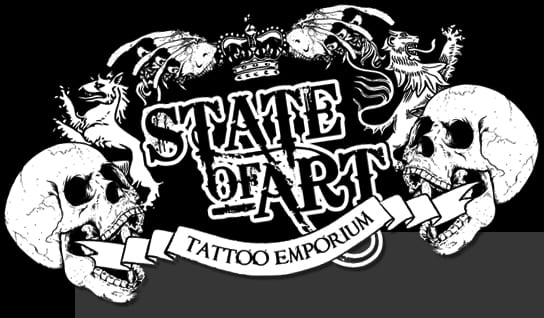
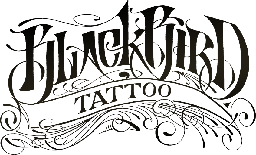
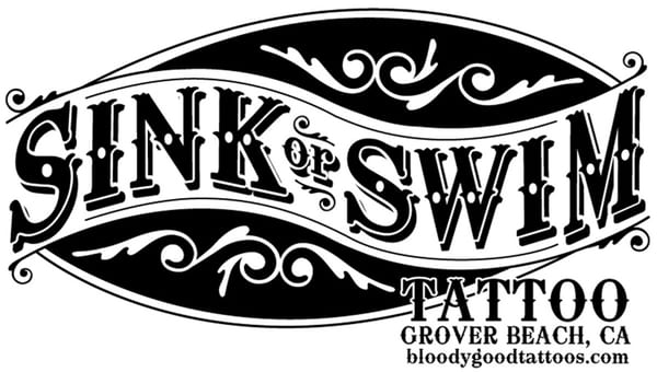
Again exploring the different typefaces I could use for my designs, I had a look at original tattoo parlour typefaces to gain inspiration. As you can see the types and logos I looked at are all very similar. These 3 photos are a good representation of the design of tattoo parlour’s logos. All using black ink, the font is in a western-salloon style. In my opinion these are quite boring, outdated and just simply do not look very good. With my typeface and logo, I want to push the boundaries and make something that will be visually pleasing and will make people remember it.


