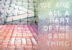
Now I have finished my geometric typeface, I thought I would try something new out. As my typeface was purely digital and all created on both Photoshop and Illustrator, I wanted to go for a more hands-on approach, making something with different materials and experimenting with unusual approaches to the brief. During one of our earlier workshop sessions I remember seeing typefaces being made out of different foods, using shapes in the environment around us and something as simple as using body parts. When conducting research and finding inspiration, one thing that struck my eye was using nails and cotton to create letters. I found a lovely image on Pinterest (can be seen down below) of a word and letters that had been created by hammering nails into a surface and then wrapping different coloured thread around them.
For my next adventure I will try and recreate something similar. I found some old plasterboard that isn’t needed and have bought some nails, a hammer and some black cotton. I am extremely interested to see how this turns out as I think it can either look extremely effective or very tacky and untidy. I have decided to just use black instead of using a colour gradient like the photo I found as being colourblind I feel this could complicate things too much.
