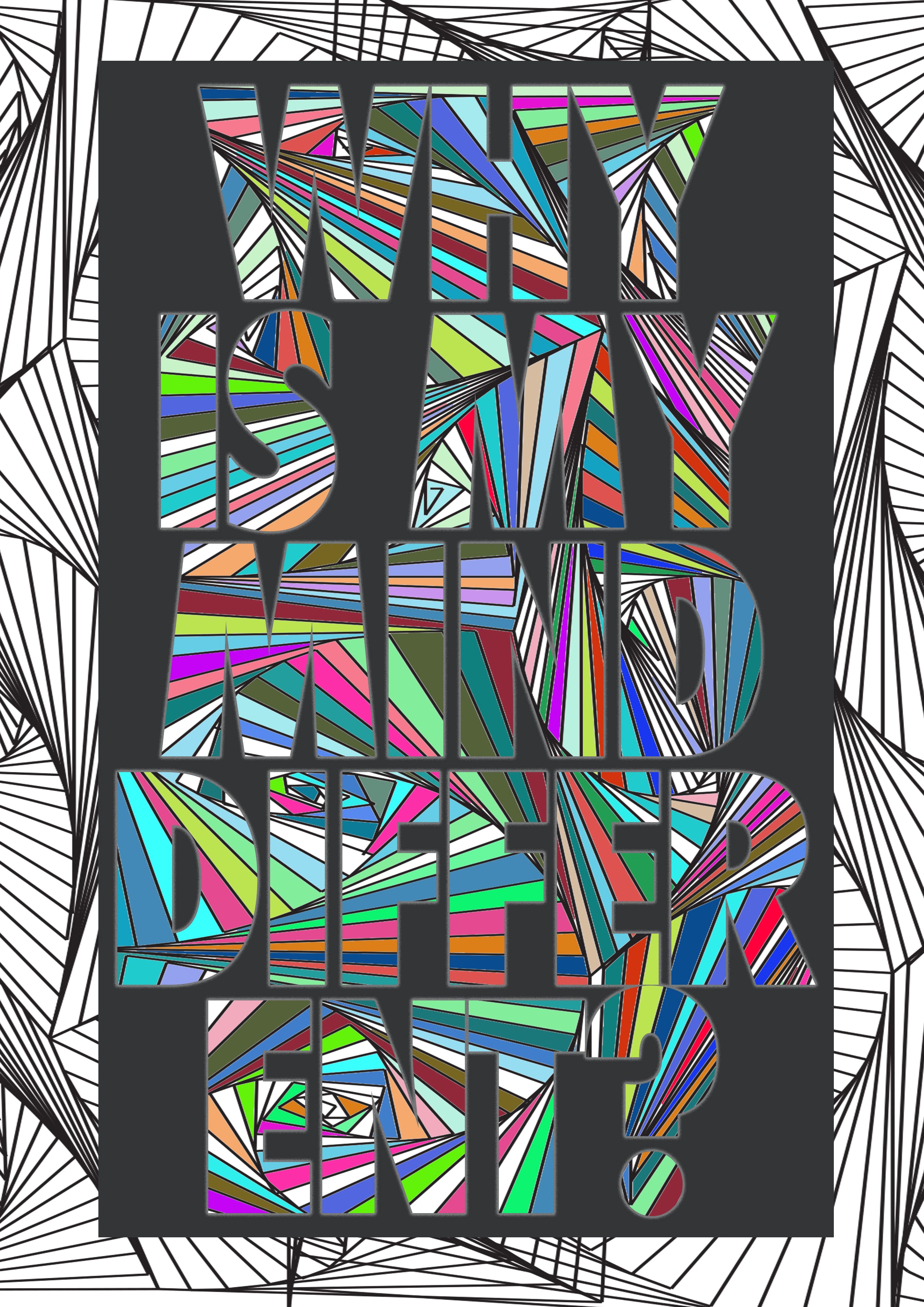
One of the suggestions I was given in my presentation was to improve my front cover a bit. A few people said it was too busy and a bit hard to read, and although I was going for this approach, I still need to make it so that it is clearly read from a distance. One member of the group suggested I should play around with the colour of the text and maybe add an outline to make it stand out against the background more. I took this into consideration and I went onto Photoshop and added a white outer glow to my text. This made the text a lot easier to read and there isn’t much difference visually.
Leave a comment