Tweeking


Untitled-1


With my tattoo design I was really disappointed with how the dot work was at the bottom. To fix this I used the rubber tool in Photoshop to get rid of all of the dots, turning it into this. I still don’t consider this completed but in my opinion it is a lot better than the original design and I am a lot happier with this. I am going to improve the bottom half some more but at this point in time I am not sure how exactly.

Improved Tattoo

My dot work tattoo for the business card definitely wasn’t how I imagined it. I am really disappointed how this came out as I don’t like the contrast between the dot work in the sky and the ocean. The top half is my favourite, I think the mountains, sky and moon work really well together and look like a professional tattoo. The bottom half however, doesn’t look as good as the top half. I don’t think that you can really tell that the bottom is meant to be the sea at all. Also, the dot work on the octopus contrasts with the dot work of the sea and it just looks too busy. I still want to use the top half of this tattoo as I really like the style but I am going to have to change the bottom. Maybe by erasing the dots or changing the octopus but it definitely needs work.


12787029_10207235585239180_1596580742_o

Tattoo Parlour Typography

Again exploring the different typefaces I could use for my designs, I had a look at original tattoo parlour typefaces to gain inspiration. As you can see the types and logos I looked at are all very similar. These 3 photos are a good representation of the design of tattoo parlour’s logos. All using black ink, the font is in a western-salloon style. In my opinion these are quite boring, outdated and just simply do not look very good. With my typeface and logo, I want to push the boundaries and make something that will be visually pleasing and will make people remember it.

logo logo aaa1e0d032b2b55a7682c0334f70374e_view

Type

Having visited Shoreditch quite recently, one thing I noticed was the amount and the style of street art. Just walking along the street you can see graffiti covering the walls adding character to the location. The photos below are just a small proportion to what you can find around Shoreditch. As you can see there are a lot of different typefaces used here, some better than others. I originally planned to use my geometric typeface made in the first semester as I think it fits in well with the design of this company, but after further research I am now thinking of going in a different direction. I will experiment with different types and I may end up using my own geometric type, but to keep up with the Shoreditch character I might have to go a bit more experimental.

ccd857d397578418ab7f881f0df0a319 eine-shoreditch-london tn_DSC_0069-copy-624x416

Popular Tattoos

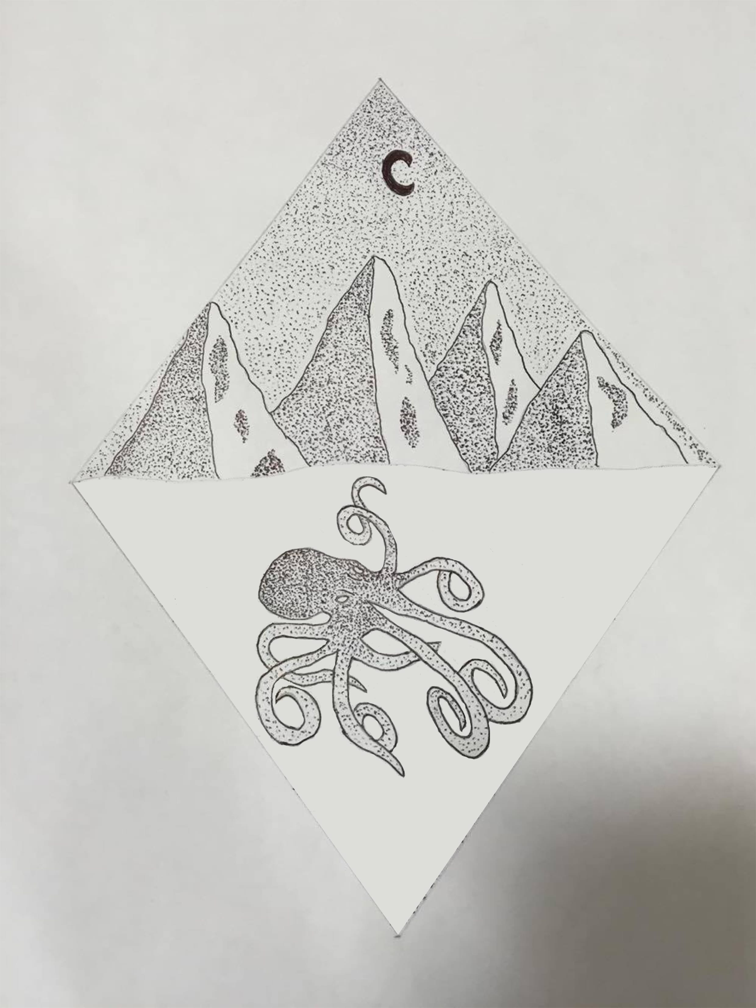
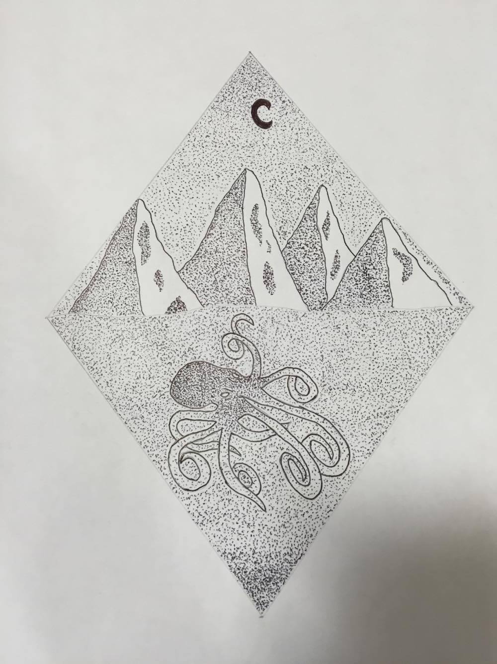
My Pinterest board here shows what the popular tattoo trend is at the moment. There is a lot of line work/dot work amongst these tattoos to make interesting designs. This is obviously the new fashionable thing as older tattoos are slowly dying out and tattoo parlours aren’t the same as they used to be. Freelance tattoo artists are more common now. With every artist specialising in something different, you can get a completely different style of tattoo in stead of picking out a pre made design from a book.

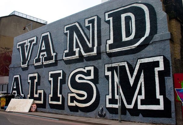
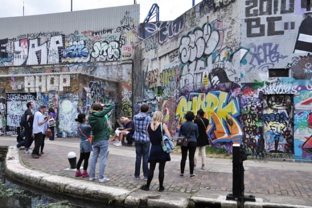
As High Seas Ink are a Shoreditch based tattoo parlour, I feel like they would be more suited to the popular tattoo style. Shoreditch is well known for its quirkiness and style and I really want to show this through my work. Incorporating the nautical theme within my designs, I am going to try and show potential clients what Shoreditch has to offer and although the parlour wants to expand and become a chain, I think its important to keep a certain house style about it- one that is suitable to the location.