Tweeking


Untitled-1


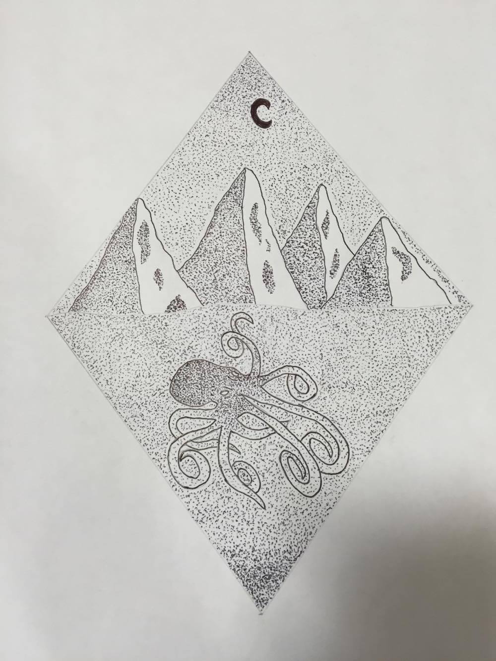
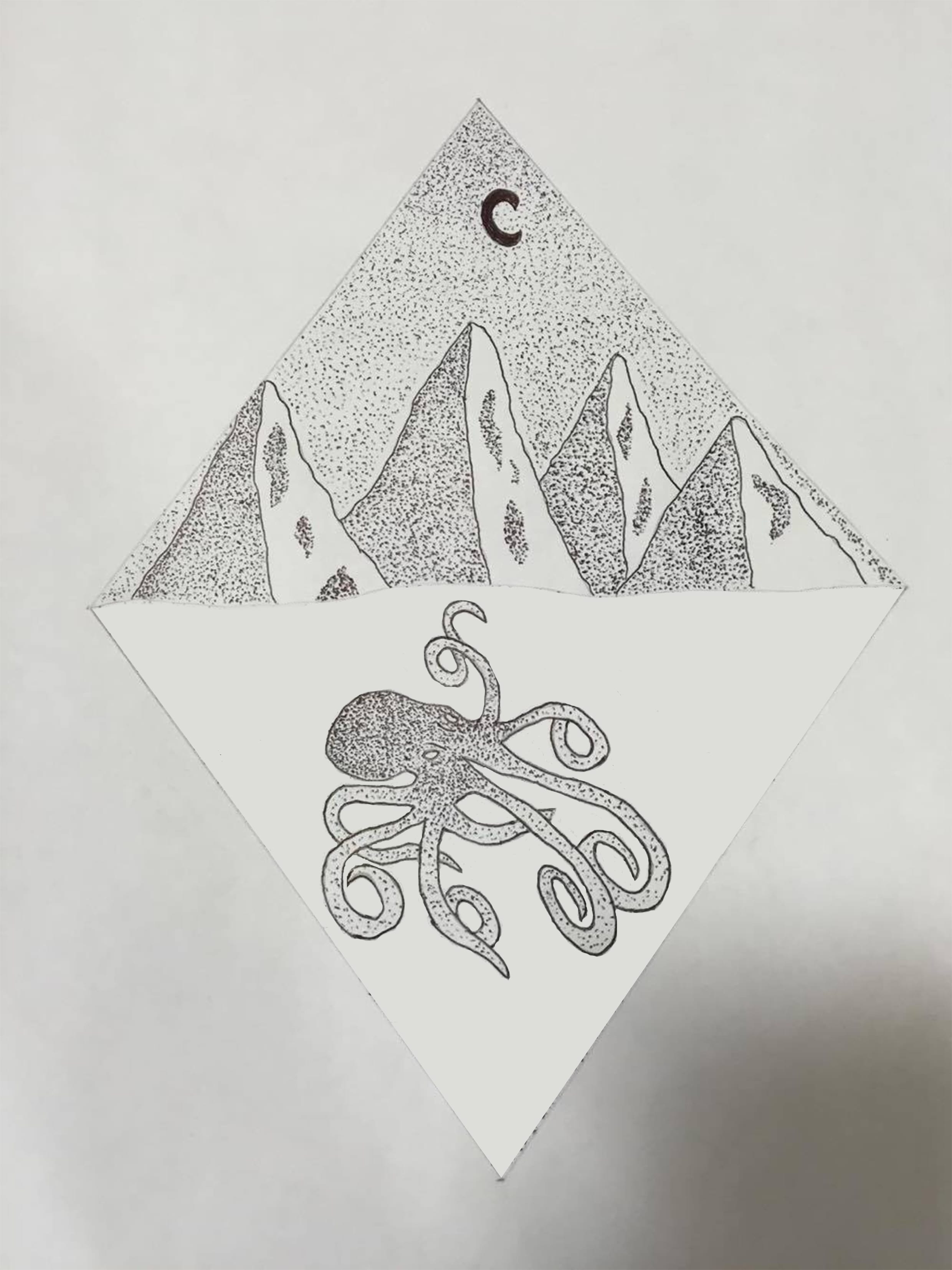
With my tattoo design I was really disappointed with how the dot work was at the bottom. To fix this I used the rubber tool in Photoshop to get rid of all of the dots, turning it into this. I still don’t consider this completed but in my opinion it is a lot better than the original design and I am a lot happier with this. I am going to improve the bottom half some more but at this point in time I am not sure how exactly.

Improved Tattoo

My dot work tattoo for the business card definitely wasn’t how I imagined it. I am really disappointed how this came out as I don’t like the contrast between the dot work in the sky and the ocean. The top half is my favourite, I think the mountains, sky and moon work really well together and look like a professional tattoo. The bottom half however, doesn’t look as good as the top half. I don’t think that you can really tell that the bottom is meant to be the sea at all. Also, the dot work on the octopus contrasts with the dot work of the sea and it just looks too busy. I still want to use the top half of this tattoo as I really like the style but I am going to have to change the bottom. Maybe by erasing the dots or changing the octopus but it definitely needs work.


12787029_10207235585239180_1596580742_o