Fifth and Sixth pages!

third page


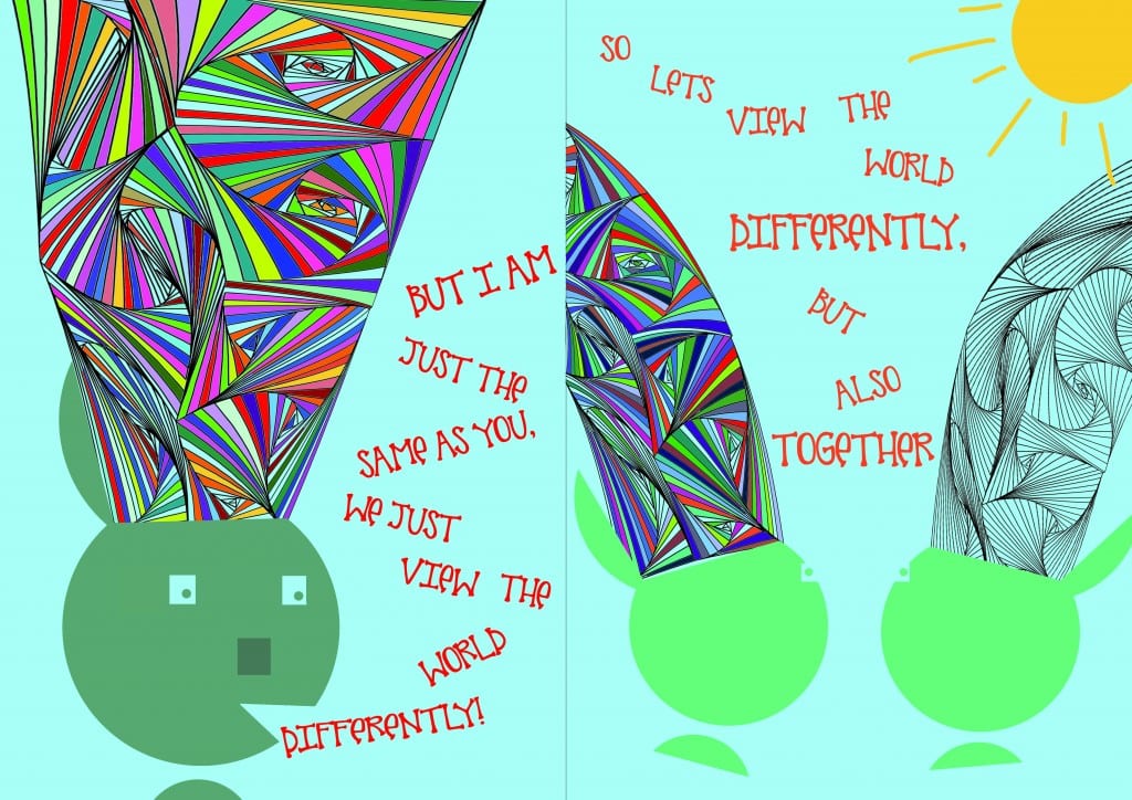
On the first page you can see that again I have positioned the test in such a way to make your eyes glued across the screen. With the text and the swirls working together, it really creates a lot of movement within the page and I think it flows extremely well. Again I have put the text in a way that looks like the character is speaking and thats the text that comes out. On the second page, I have added another character without autism so the reader can clearly see the contrast between the two types of people. I have changed the colour of the person with autism as I really wanted to show that two people can get on really well, they can be friends, no matter what disorder is getting in the way. This is why I have also included the text, so the two characters can be different together. Both of these pages have minimalistic backgrounds and I again chose this so the emphasis is on the characters. I really like the second page, and how I have the two characters sat there watching the sun and the world go bye. I think it is a very nice ending to the book as it will show people with autism that everything will be alright in the end.
 

Second double page spread

second page

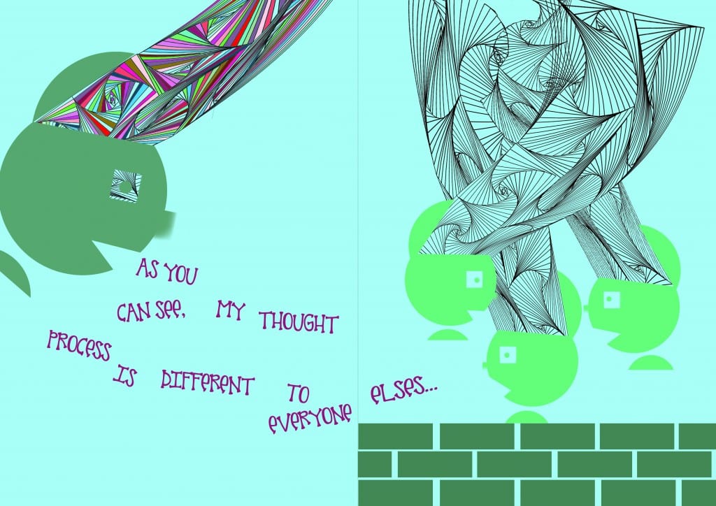
For my second page spread, I wanted to again include my character with autism but show some people without. This links well with the front cover as the swirls from the two types of characters match their minds. I really wanted to make a page like this just to show the difference and how difficult it is for someone with autism to socialise. I have also made my 3 other characters a different colour to make the difference stand out more as I wanted this page to show a deeper side to the disorder. Again I have used a simple background to draw more attention to the movement and the minds of the characters and to make it really stand out.

First double page spread

first page line middle

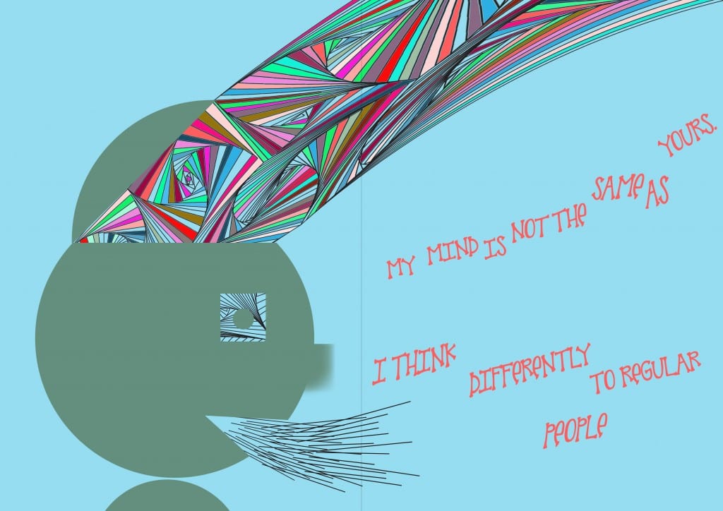
Here I have my character starting off the book by saying how their mind is different. I used the style of Rand to create movement by having the text spread across the page. I have tried to make it look like it is coming out of the mouth and I think this works quite well and looks really nice. I have gone for a minimalistic look here as I don’t want to overcrowd the page with the busyness from the characters mind. As you can see I have used the same colourful swirls here to connote the mind of someone with autism. I thought I would change it a little bit though. As autism is a spectrum disorder, no two people are the same, even though they share qualities, everyone with the disorder has their own little traits. This is why I have decided to use different colours and different swirls for all of my pages as I really want to get across the message of how complex autism is without having to spell it out with text.

Front Page improved

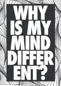
Now I have added colour into my front page, I think it looks so much more professional and a lot more appealing to children. I chose to add in more swirls to the actual text and then to colour them in all individually as I think this is a better representation of autism. The coloured swirls within the text represent someones mind with autism and the black and white swirls outside the box represents someones mind without autism. It connotes that the busy swirls are like the busy brain of the mind. There is a lot going on here which can often be quite difficult and stressful for someone with the disorder. And then to compare that to the regular swirls, it connotes a more relaxed mind.

I really like how the design represents the two types of people. I am going to continue with this style throughout my book and I hope it has a big impact on the reader.

front page 2

Front page

For my front page, I want to take a different approach and create something that doesn’t look like a children’s book. For a lot of people with autism, they are extremely intellectual and I personally do not think that a typical children’s book cover will appeal to them at all. I want to try and make something different using my first design to represent someones mind. Another trait with autism is that there senses are a lot stronger than other peoples so I need something eye catching that when on a bookshelf, will draw the attention of not only people without autism, but also people with it.

front page


I really like this design as I think it is extremely unique and looks very professional. However looking at this from an outsiders point of view, it almost looks like a regular novel and may not appeal to a younger audience. It is lacking one thing in particular and that is colour. I think once I have incorporated some colour into this design, it will not only be a very interesting front cover, but it will look quite professional and to a high standard.